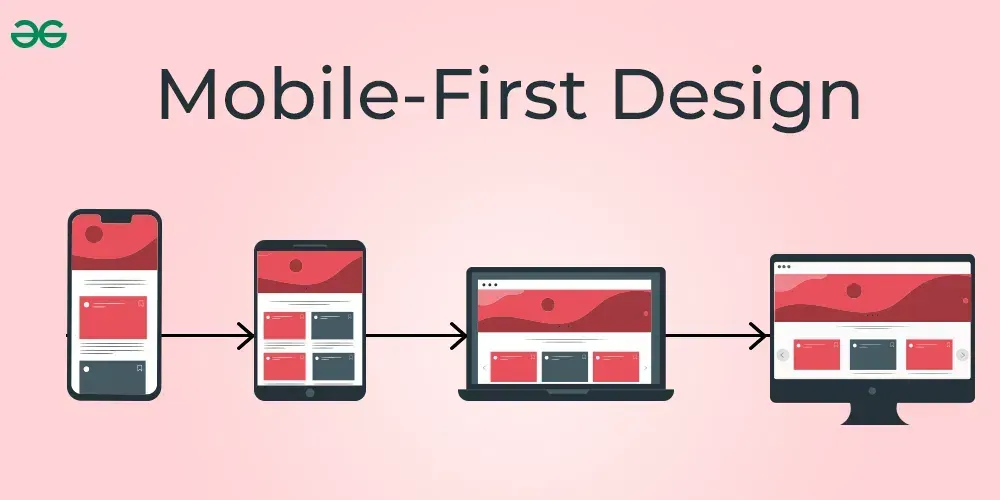
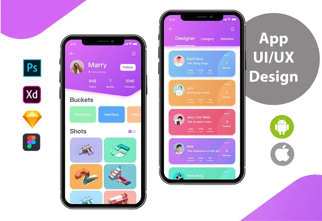
Mobile-first UX sets the baseline for designing experiences that feel fast, focused, and effortless on small screens. By starting with the constraints of the smallest device, teams naturally embrace mobile-first design principles, ensuring content scales cleanly to larger viewports. Applying mobile UX best practices keeps touch targets large enough, reduces load times, and prioritizes clear CTAs for conversion. A responsive UX mindset means layouts collapse gracefully while maintaining a coherent hierarchy that guides users from curiosity to action. This approach aligns with mobile-first web design, ensuring the experience remains consistent across devices.
A mobile-centric mindset places handheld users at the center of every design decision. This means thumb-friendly layouts, legible typography, and streamlined paths to value, all optimized for fast interaction on phones. An emphasis on lean interfaces, progressive disclosure, and performance-first planning helps teams deliver seamless experiences across devices. By framing the journey around mobile contexts—signals that scale to tablet and desktop—organizations unlock consistent usability and improved engagement.
Mobile-first UX: Core Principles That Drive Conversion and Speed
Mobile-first UX starts with the essentials, placing content first on small screens so users see the value immediately. This reflects mobile-first design principles: distill information to what users need now, then layer context as the viewport grows. When content is lean, pages load faster, and the path to value becomes clearer, supporting mobile-first web design that prioritizes speed, clarity, and quick actions. By aligning with these patterns, you support better performance metrics and conversion signals while maintaining accessibility.
Thumb-friendly interfaces, fast performance, and clear navigation are the practical pillars of this approach. Tap targets should be generous, the layout should adapt with responsive UX in mind, and a first-screen conversion focus ensures users can act without friction. Optimizing to design for mobile conversion means keeping forms short, using legible typography, and placing the primary CTA above the fold, backed by credibility signals and social proof. This aligns with mobile UX best practices, like thumb-friendly targets and accessible color contrast, and with the broader mobile-first web design philosophy.
Practical Patterns for Mobile-first Web Design
Implement bottom navigation, progressive disclosure, and optimized media to deliver a responsive UX that scales from phones to tablets. These patterns are core to mobile-first design principles and mobile-first web design, ensuring essential actions remain accessible as viewports change, while keeping load times fast through image optimization and lazy loading.
Measure success with mobile UX best practices, A/B tests, Core Web Vitals, and conversion metrics. Use insights to refine patterns, from microcopy to CTA placement, and maintain accessibility across devices. This data-driven loop embodies the LSI approach, connecting related terms like responsive UX and design for mobile conversion to the ongoing optimization of a mobile-first experience.
Frequently Asked Questions
How can Mobile-first UX guide interface design to boost conversions on mobile devices?
Start with the essentials on small screens by applying mobile-first design principles: prioritizing a clear value proposition, thumb-friendly tap targets, and a prominent CTA above the fold. As you scale to larger viewports, progressively reveal details using a responsive UX approach, ensuring fast performance and a frictionless path to action. By focusing on core content, fast load times, and simple navigation, you align with Mobile-first UX goals to improve mobile conversions.
What are key mobile-first web design practices that improve speed, usability, and accessibility across devices?
Adopt mobile-first web design by optimizing assets (images, fonts, scripts), keeping forms short, and using progressive disclosure to reduce cognitive load. Emphasize thumb-friendly interactions, clear bottom navigation, and accessible color contrast to support mobile UX best practices. Ensure responsive UX behavior so layouts adapt gracefully to larger screens while maintaining performance metrics like Core Web Vitals, which helps usability and conversion on all devices.
| Principle | Key Idea | Practical Tip |
|---|---|---|
| Start with the essentials: content-first on small screens | Distill content to what users need now (answers, actions, next steps) | Concise headline, clear value proposition, primary CTA; reveal more on larger screens |
| Thumb-friendly interfaces and tap targets | Design with thumb reach; 44×44 px targets; generous hit areas | Maintain consistent placement; use cues and microinteractions; optimize for thumb use |
| Speed as a feature, not a luxury | Performance is essential; optimize assets; Core Web Vitals | Compress images, efficient fonts, minimal JS; prioritize above-the-fold content |
| Clear navigation and content hierarchy | Straightforward path to value; bottom navigation; recognizable icons | Scannable sections; short paragraphs; whitespace; predictable behavior |
| Design for conversion from the first screen | Conversion-minded sequence; CTA above fold; social proof | Nudge toward action; minimize distractions; ensure prominent CTA |
| Input efficiency and form optimization | Short, device-friendly forms; right input types; autofill | Inline validation; minimize required fields; reduce friction |
| Typography, readability, and visual hierarchy | Legible typography; 16px base; good contrast | Clear hierarchy; adequate line height; accessible color schemes |
| Accessibility and inclusive design | Inclusive design; assistive tech compatibility; color accessibility | Alt text, keyboard navigability, ARIA roles; accessible controls |
| Responsive UX and adaptive thinking | Layout adapts to larger viewports; images and typography scale | Fluid grids; scalable assets; maintain mental model across devices |
| Testing, iteration, and data-driven improvements | Continuous testing and data-driven decisions | A/B tests, analytics on task success and funnel points; iterate |
Summary
Mobile-first UX sets the tone for modern digital products by prioritizing the mobile user from the outset, grounded in mobile-first design principles, responsive UX, and mobile UX best practices that guide design for mobile conversion and support a strong mobile-first web design. This approach emphasizes speed, clarity, accessible navigation, and thumb-friendly interactions, enabling a smoother, conversion-oriented user journey across devices. By starting with a compact, thoughtful mobile experience, teams can reduce clutter, accelerate core tasks above the fold, and maintain accessibility and performance as layouts scale to larger screens. In practice, Mobile-first UX leads to more consistent brand experiences, better engagement, and measurable business impact across mobile and desktop touchpoints.


