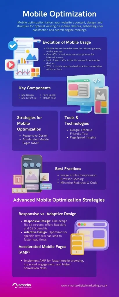

Mobile-Optimized UX: Boosting Conversions on Small Screens
Mobile-Optimized UX sits at the heart of modern web experiences, shaping how people discover, engage with, and convert on devices ranging from smartphones to tablets, and it sets the tone for every subsequent interaction a user has with your site or app, setting expectations for performance across devices and influencing how fast pages feel and how easily information is accessed during a first impression.A thoughtful mobile user experience means fast loading, legible typography, thumb-friendly navigation, and friction-free checkout, all of which influence trust, engagement, and ultimately conversions, while also shaping how your brand is perceived in search results and social feeds, where impressions are won or lost in seconds.
Mobile-Optimized UX: Boosting Conversions on Small Screens Read More »